
Designing Your Brand Identity: 5 Tips from a Designer

Social Media Manager, Tinsley Creative
A brand’s identity is heavily based on memorable design elements. Think about it, an identity is what makes an individual or company ultimately recognizable to others. A good example would be how you present yourself to others. How would your friends describe your style and overall demeanor?
Now take those same questions, and apply them to your brand.
- What is your brand’s personality? Describe this with your team as if you’re describing a person.
- What are your brand’s values? These are the beliefs that will drive your brand’s mission.
- What is your brand’s voice? This voice will set the tone for your brand, solidifying your personality.
Laying the Foundation
You want to stand out. You want your brand to be known. Even the most iconic brands started with these simple questions! Yes, even Starbucks, Coca-Cola, and Target were once unknown brands. It’s crazy to think about, right? These brand logos are considered some of the most recognizable logos of all time. That says a lot when you think about how many brand messages we ultimately consume each day.
So how did these brands set themselves apart from their competitors and become household names? We sit down with Art Director Brittany Huey who shares the building blocks that will start you on your journey in shaping your brand’s identity.
1. How much research is involved in starting the design process for a brand?
Research plays a large role in the initial phase of design. It’s important to identify the intended target audience and understand how to best relate with them, as well as identifying current industry standards and/or trends. This information will be crucial in almost every aspect of branding as you progress forward.
2. What goes into creating a brand’s logo? What is it about a logo that makes someone recognize it?
After I’ve done my research, I’m ready to begin designing. Each designer may approach this step differently, but this phase of designing for a logo begins with concepting. Getting your thoughts and ideas together and putting them on paper/screen. I work towards eliminating and refining concepts until I’m happy with my options. Up until this point, I’ve left the logo design in black and white, because it’s important to make sure a logo looks great at all times, not only in color. Once color is added and the last bit of “tweaking” is done, you’re ready to share it with the world.
Pro tip: It’s important to keep it simple, legible, and easily adaptable across all mediums. It’s intended to be a mark that represents your brand, but doesn’t have to be fully inclusive as a tell-all. A good logo is often recognized by a logo mark, or even an identifying font that is unique to the brand. Also, a sense of familiarity is important to consumers as they are often quick to identify shapes and colors that make them feel a certain way and will lead them to deduct their own interpretation of the brand.
3. Why are brand style guides important and what elements should you include in the brand guide?
A brand guide is used to keep branding on point, especially when there are many individuals involved in marketing the brand itself. Brand guides may vary in content, but generally include your primary logo, variations of your logo, general rules for how a logo should not be used, colors with Pantone, CMYK, RGB and/or hex code values, typography comprising your logo and any additional fonts you wish to include as a standard for the brand.
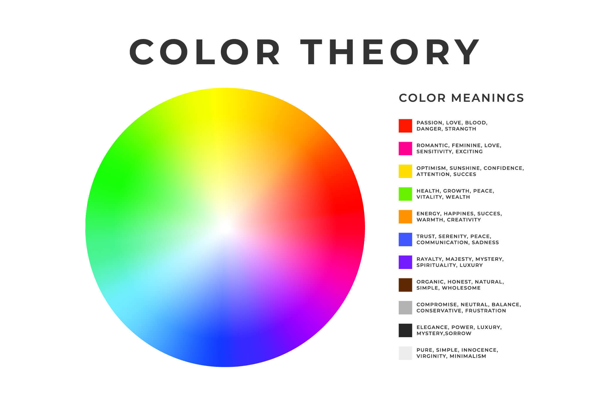
4. How does color and typography tie into being the foundation of a brand’s identity? How do you go about choosing the right fit?
Choosing colors has more to do with my findings in research. Personal opinions aside, I’m not selecting a color because it’s my favorite. It has more to do with what it represents and how it will be used to spark a certain emotion in my audience. Fonts are a little different, there’s a little more freedom when it comes to selecting the perfect font, but don’t go crazy. Too many fonts will distract from the overall piece and make it harder to streamline branding practices. It’s better to incorporate families of fonts with a variety of font weights and styles. Also, custom fonts can be great, but keeping a more standardized font (available on all operating systems) is crucial to ensure the integrity of your brand across mediums.
5. How does photography tie into designing a brand’s identity? Whether it’s shot by a professional or a stock download, photography helps to tell the brand’s story.
You want to be consistent in style and look for similarities that can help unite photography across the board. Maybe it’s a close-up detail, action, or lifestyle shot; 1 person, groups of people or none; different genders, ages or race. All of these identifiers can help establish consistency that speaks to the brand’s overall appearance. On another note, finding the right photos also means quality resolution. As great as a photo may be, if it’s resolution limits it’s usage, meaning it can’t be enlarged to look great as a poster or billboard, then it really isn’t the best option for your brand.
How Has Brand Identity Shaped Your Daily Life?
To further our point, try out this logo quiz we found to see just how important EACH element of the design process is. I’ll share my results: 11/11! Even I was surprised at the lasting impact each of these brands have had on my memory over the years.

These brands have left a lasting legacy and yours can, too! Stand out from the crowd by taking the time to invest in your image — it can be the deciding factor of your success.


